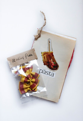
Influenced by my current project, taking a classic symbol of Italy and
making a small response book with collage, stamps, pen and ink. The idea is this small booklet is then posted to the Mail Art Project and any work posted will be stored in a catalog and exhibition. Just a small self promotion project that was a quick item to produce. Also a nice break from the architype. Inside features a range of pages with different elements, two pages are Renaissance recipes, one written in Latin. All pages include cut and paste from magazines.
Tuesday, 16 February 2016
Monday, 1 February 2016
Florence Cathedral - Architype
Designing my next piece of Architype was the Florence Cathedral. It was a pretty tough challenge, it took me many many hours over a course of 2 weeks. The high detail in the decor is amazing and hard to illustrate in pure type. It is a big step up from the building of St. Pauls purely because the scale is 3x bigger and more detailed.
I then tried printing out across 9 A4 pieces of paper, to resemble A1 size (purely because I don't have an A1 printer.) There are some slightly inconsistencies between the panels because of slight cropping errors but I think it is one of my most successful graphical pieces of work. I think the image is also quite appealing because it works in the rule of thirds!
Labels:
16th century,
2015,
2016,
archi-type,
architecture,
everything,
florence,
florence cathedral,
graphic design,
letter,
michelangelo,
numerals,
photoshop,
pinned,
renaissance,
times new roman,
typographic,
university,
work
Subscribe to:
Comments (Atom)


