Showing posts with label work. Show all posts

Wednesday, 5 October 2016

Inktober

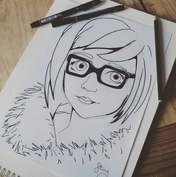
I started Inktober this month, the challenge is to draw every day during the month of October. It seems really fitting seeing as I just started my Illustrative Instagram account and need to put work out there! I've added my Instagram to both my website and blog which can be found along the menu; otherwise my account is @sophiekingillustrations. Feel free to give me a follow if you'd like, I'll be posting daily during October! 

 My drawings with range from style and time taken, some will be quick doodles while others will be longer projects. I hope I can do them daily, I don't see why not..

Here's a couple I've done so far.
 
https://gyazo.com/fe98d73ad2afe5bca8317102fb8cd561 https://gyazo.com/009e95c3cd39f88b1b14cede068b603b

Tuesday, 28 June 2016

Final Year Show

The final year show has come and gone! I submitted 3 A2 screen prints along with a landscape book of Renaissance Architecture. After a year of trial and error I finally nailed the technique for large screen prints and I'm really happy with how the finals came out. 


For the show I also created some free to take zine books with a little bit of information about the buildings themselves. I had work on sale in the shop including one of the buildings as well as some prints of the HMS Victory I did previously.


The landscape concertina book, made up of the same prints as the larger scale versions. Handmade the covers and bound myself. I learned so much about Renaissance architecture over the year and it really inspired me. I enjoy historical subjects so much and probably enjoying researching more than producing actual artwork! 


I presented my prints as a sort of "planning wall", perhaps how an architectures study may look. Pinned up prints and plans to build a bigger picture. Although I didn't manage to sell any prints at the show I shall be selling them on my Etsy page. I also have been contacted since with an offer to sell my work on a website but I'm not particularly interested as they were only willing to offer me 20% of the selling price. Now I just have to produce more personal work and get out into the world with my 2:1 degree!

Monday, 2 May 2016

Watercolour painting

Haven't done any water colouring in just over two years, got even some new range of colours and decided to try them out. Previously I had 8 colours whereas now I have a palette of 24! No white though for some reason, so that's done in acrylic watered down as well as an acrylic white pen.  It's quite different style from how I usually draw but I feel like I'm testing my boundaries a bit and building my portfolio of work!


The painting is of a character named Nu Wa from the video game Smite. Nu Wa is the god of humankind in Chinese mythology and I have quite an interest for historical myths and legends so I think it still fits into my work! It was just nice to paint something different and take a break from so much digital work.

Monday, 18 April 2016

Logo comission

I got asked to do a logo design for a new merging band, Cherry Bomb. I did some rough sketch ideas and then adapted from there.


It was my first time using Illustrator and my graphics tablet because I wanted the logo to be vector based. I will definitely try Illustrator out again because the vector paintbrush is like a blessing! I also need to increase my Illustrator skills so that I can work in a more broad job! I'm pretty happy with how it came out and can't wait to play around some more with the paint brush.


Monday, 11 April 2016

Florence Cathedral prints

I did a few experimental prints for my Florence Catherdral building a few weeks ago, just got around to photographing them as they were large scale and hard to get home on a bike! I was playing around with paper textures, sizes and printing different amount of layers and colours. They are A2 with the last image being A1. I still don't really enjoy doing silk screening at large scale as the process is quite stressful but it does produce some really nice prints!

I tried using this triangular paper, it was kind of pre-scored paper and I thought it suited architecture well in relation to trigonometry. Although you can see the triangles through the print.  I also tried a yellow background on white paper.
 Lightening up the grey, making it less purple gave the building quite a nice feel.


 I used some antique white card, so it is slightly more cream than white. I also made this print four layers adding a white outline underneath the black to sort of add an element of highlights. I really like how this print came out.
 These last two prints were more experimental adding in mixed media scraps of paper that didn't work quite well. The last image didn't come out at all and I can only put that down to the paper type, it was thick and heavy water colour paper and no matter how many times I'd go over the screen it wouldn't come through!

The development progress has come on well since these prints and I'm currently producing the last large scale! Will get photographs of those as I produce them. 
 

Friday, 4 March 2016

Southsea Rock and Gift Brief

I was set two briefs, one to create a greetings card and the other to create a gift that would be given to international students when our University travels. Both of these had to represent Portsmouth and they could both be of the same design. So I created a greetings card featuring the HMS Victory made in the same way I create my Renaissance buildings, in type. I then screen printed 4 layers to build up the colours and outline of the ship. I enlarged the ship to A3 and printed the same four layers and colours which I then made into an informational fact book about Victory that worked as a 4 fold booklet that could be unfolded into a poster . 


Tuesday, 16 February 2016

Mail Art Project - Renaissance Pasta

Influenced by my current project, taking a classic symbol of Italy and making a small response book with collage, stamps, pen and ink. The idea is this small booklet is then posted to the Mail Art Project and any work posted will be stored in a catalog and exhibition. Just a small self promotion project that was a quick item to produce. Also a nice break from the architype. Inside features a range of pages with different elements, two pages are Renaissance recipes, one written in Latin. All pages include cut and paste from magazines.


Monday, 1 February 2016

Florence Cathedral - Architype

Designing my next piece of Architype was the Florence Cathedral. It was a pretty tough challenge, it took me many many hours over a course of 2 weeks. The high detail in the decor is amazing and hard to illustrate in pure type. It is a big step up from the building of St. Pauls purely because the scale is 3x bigger and more detailed. 

 I then tried printing out across 9 A4 pieces of paper, to resemble A1 size (purely because I don't have an A1 printer.) There are some slightly inconsistencies between the panels because of slight cropping errors but I think it is one of my most successful graphical pieces of work. I think the image is also quite appealing because it works in the rule of thirds!


Friday, 8 January 2016

AQA Results

So today I took my AQA exam and I have now achieved... *drum roll*

Two badges, Photoshop and InDesign. I am officially Adobe certified!

Monday, 4 January 2016

Artists I like #10

Upon listening to some albums to kick off the new year I noticed that the album artwork for the Fall Out Boy album, Infinity on High, had some similar aspects to my photography work. It looks like a small set made up of different elements and then photographed. 

Making these little sets myself I notice all the small details, for example Infinity on High is something that Vincent Van Gogh said and the starry sky painting seems to be portrayed in the background on the album. Also the small little coat hangers in the cupboard and books under the bed catch my eye. As far as I can find out the person who designed the set is Todd Fjelsted and the photographer is Pamela Littky. Pamela seems to work with a lot of A-list celebrities and seems to produce a lot of their album artworks while Todd's work seems widely ranged in many talents yet I can't find any work that looks similar to the set for the album. 
Researching more I found another artist produced artwork inside the album, Chuck Anderson, and his Photoshop work is truly inspirational. Even designed the Windows 7 wallpaper! A lot of Chuck's work is similar to the work I use to enjoy doing when I was younger on Photoshop, bright colours and highly edited images. Almost what I'd call special effects in Photography.  I have no added him to my collection of artists I like and find an inspiration in the Photoshop world!


Tuesday, 17 November 2015

Updated Christmas card #3

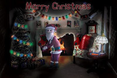
I finally got my main design finished for my Christmas card and it's now available for purchase! I re-done the lighting on the card and made some small tweaks, like turning the lamp on. I'm very happy with the outcome and I know have it for sale on Etsy!


https://www.etsy.com/uk/listing/256498056/santa-visiting-christmas-card?ref=listings_manager_grid

https://www.etsy.com/uk/listing/256498056/santa-visiting-christmas-card?ref=listings_manager_grid
 

Saturday, 14 November 2015

Christmas cards #2

I finished another design set for Christmas cards, these are a unique idea I haven't really seen before. They're recipe cards so the actual Christmas card has a bit more use to it rather than just being recycled after Christmas!
I'm selling them on my Etsy shop 🎅 


Friday, 13 November 2015

St Peter's Architecture

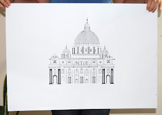
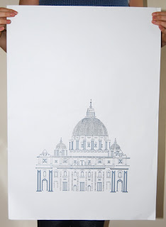
My self directed project for my final third year is The Renaissance. It started off with Rome as a general focus and slowly I decided I love the architecture and artists of the Renaissance period.  I create this image based on work by Cameron Moll who creates images of structures in type. I chose St Peter's because of how impressive the architecture is not just inside but outside too. I used Times New Roman because that's the type face that can be seen on the outside of the building, I only used numerals and letters to create the shape of the building. 
I then took the image and created it into a silk screen, I tried two toned layers as well as including colour to certain parts of the building. I worked at an A3 scale on Photoshop and printed onto A2. You can see the whole collection of prints on my website or by clicking one of the images. 

http://sophiemayking.wix.com/sophieillustration#!renaissance/cyf1

http://sophiemayking.wix.com/sophieillustration#!renaissance/cyf1


Monday, 2 November 2015

Cut and Paste workshop

In a workshop by one of our lecture's, Lorna, I looked at using cut and paste methods from pre-exisiting materials to create a new illustration. I had to choose a type of machine/appliance and create a super hero that held the qualities of that machine. We had to consider costume, accessories and a name. I wanted my super hero to be themed around my current subject, The Renaissance, so I chose the pasta making machine. Using some books I had of Michelangelo's paintings I cut out one that featured Christ and chose him to be the 'Perfect Pasta Painter'; his power of being able to paint pasta perfectly and it comes to live. How does this save the world?.. By providing delicious perfect pasta whenever my super hero paints! He holds his best paint brushes and his staff of pasta to provide those who need a bite to eat.


Wednesday, 16 September 2015

Betty Spaghettis

I wanted to create a range of possible birthday/occasion cards that could be given to family members or friends. I took my old favourite 90's toy 'Betty Spaghetti' and arranged them in situations that could be featured on the front of the card. Most of the scenes are brothers and sisters helping each other out. I did a few other scenes but the lighting wasn't that great once I reviewed the photos.  

...

Monday, 16 March 2015

Knights and Chivalry - Bookworks

Looking at the book sculptures by Alexander Korzer-Robinson I decided to create my own. I bought an encyclopedia of Knights and Chivalry and one by one began to remove the pages only leaving some images. The book had 236 pages and only 29 separate images were left by the end. It is a long process but very rewarding, you can see the image building up bit by bit and it's surprising how well the images through out the book can layer one into one narrative. A very delicate but fun process.


Monday, 9 March 2015

Coat of Arms Tunnel book - Bookworks

After finding a new love with tunnel books I created a few mock ups and then a final version. I wanted the Coat of Arms to go back in layers with each layer broken down into each component of the arms. I painted by own Coat of Arms for my surname and made a book to resemble the materials medieval books were made from.

...

Sunday, 1 March 2015

Leather bound book - Bookworks

My new project is based around making and the history of books. My brief is to pick a book written by Sir Arthur Conan Doyle and then take inspiration from it and move in a certain direction. I chose the book "Sir Nigel" which is the story of Knight from the Medieval period. This lead me to research what books looked like that were made from the Medieval time period. I then created my own book based upon my research, so this is my second attempt at a leather covered book. It still needs work but I'm quite happy with the final look, especially the leather bound strap!


Tuesday, 10 February 2015

Violence Attracts - Social Awareness

I used a couple of clippings from magazines and decided to create some posters that would draw in the audience via violence. Violence seems to have more of an attraction than positive medias. I thought I'd play on peoples attraction and then once they actually see the poster, it is in fact a positive message. They're just basically watered down acrylic paint splatters with the cut out and some letter pressed facts.


Monday, 9 February 2015

Pixel People - Social Awareness

Trying my skills at Illustrator I wanted to create a pixel animation that could be resized without loosing the "pixel" look. Technically using Illustrator does not allow the creation of images by pixels because it's a vector based program. By using Photoshop I could not resize the pixels so I did a painful process on Illustration using grids.This ended up taking hours because of the process I chose but I'm happy with the outcome!