Showing posts with label photoshop. Show all posts

Monday, 14 March 2016

My "process"

Thought as I was creating some illustrations I'd document the journey and show my favourite way of creating art work. I started out with drawing in pencil and then outlining in fine liners, 0.3 and 0.1. These sketches were some ideas for my business card. I couldn't decide whether I wanted it a portrait of me or show off my historical passion.

 Next I scanned the outline into Photoshop and clean up the image removing any specs that manage to show up in the final image. 


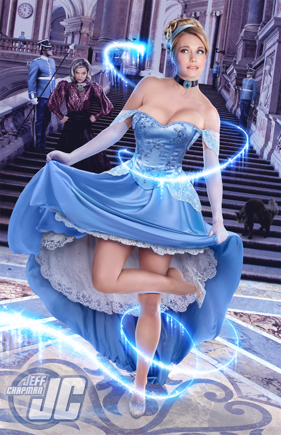
 Adding the clothing is probably my favourite part of the process, I find images or fabrics online or those I've scanned in myself and add them into the drawing. For the tudor dress I found a dress online that I liked the pattern of, using layer masks I select the area I want the dress to display in.


 Using Liqufiy I then manipulate the dress to fit into the drawn outline to make it fit my character. Sometimes (like I had to do for this image) I create multiples of the same layer but tweak them to fit each element separately. For example the top half of the dress is in three layers, the bust and two arms. This way I can make the outfit fit much better.


One all of the outfit is fitted into place I just use Dodge and Burn to add highlights and shadows to the dress where it matches on my outline or perhaps where shadows should be that aren't on the fabric. On this specific dress I added highlights and shadows to the pleats, shadows to the inner sleeve, under the arms and highlights to the chest.


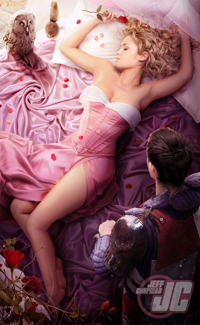
 The same principle applies to the other character!


Then I print the images onto 90gms paper on High setting. Sometimes I print on thicker paper depending on what I need the characters for. I colour the hair and skin with pencils and anything black I also colour with pencil. Printing black fabric just consumes more ink and comes out quite dark, whereas with pencil I can create shadows and textures without the ink usage. 


Using a scalpel I cut them out!


I use a black felt tip  to go around all the edges of the characters, this is a tip I learned from Terry Gilliam. The black takes away the sharp white paper edge and makes the characters seem more realistic and less paper like. 


These characters then were posed in sets, I have a small set pre-made for tudor settings with doll furniture and having my dad be a gardener means there's always colour and flowers in our garden anytime of the year which gives me free sets (if the weather is good!)


 The photos I take then go through the adjustment process in Lightroom. Small adjustments to make the colours correct or more vibrant. Moving back into Photoshop with the final images I played around until I got some card designs I quite liked. The tudor design went through a bigger process of highlighting and shadowing and adding in the fireplace. The photos could also be used for images, stories or anything else I like. I take a huge range of photos at different angles to make a bigger range to choose from.


Monday, 1 February 2016

Florence Cathedral - Architype

Designing my next piece of Architype was the Florence Cathedral. It was a pretty tough challenge, it took me many many hours over a course of 2 weeks. The high detail in the decor is amazing and hard to illustrate in pure type. It is a big step up from the building of St. Pauls purely because the scale is 3x bigger and more detailed. 

 I then tried printing out across 9 A4 pieces of paper, to resemble A1 size (purely because I don't have an A1 printer.) There are some slightly inconsistencies between the panels because of slight cropping errors but I think it is one of my most successful graphical pieces of work. I think the image is also quite appealing because it works in the rule of thirds!


Friday, 8 January 2016

AQA Results

So today I took my AQA exam and I have now achieved... *drum roll*

Two badges, Photoshop and InDesign. I am officially Adobe certified!

Monday, 4 January 2016

Artists I like #10

Upon listening to some albums to kick off the new year I noticed that the album artwork for the Fall Out Boy album, Infinity on High, had some similar aspects to my photography work. It looks like a small set made up of different elements and then photographed. 

Making these little sets myself I notice all the small details, for example Infinity on High is something that Vincent Van Gogh said and the starry sky painting seems to be portrayed in the background on the album. Also the small little coat hangers in the cupboard and books under the bed catch my eye. As far as I can find out the person who designed the set is Todd Fjelsted and the photographer is Pamela Littky. Pamela seems to work with a lot of A-list celebrities and seems to produce a lot of their album artworks while Todd's work seems widely ranged in many talents yet I can't find any work that looks similar to the set for the album. 

Researching more I found another artist produced artwork inside the album, Chuck Anderson, and his Photoshop work is truly inspirational. Even designed the Windows 7 wallpaper! A lot of Chuck's work is similar to the work I use to enjoy doing when I was younger on Photoshop, bright colours and highly edited images. Almost what I'd call special effects in Photography.  I have no added him to my collection of artists I like and find an inspiration in the Photoshop world!


Friday, 13 November 2015

St Peter's Architecture

My self directed project for my final third year is The Renaissance. It started off with Rome as a general focus and slowly I decided I love the architecture and artists of the Renaissance period.  I create this image based on work by Cameron Moll who creates images of structures in type. I chose St Peter's because of how impressive the architecture is not just inside but outside too. I used Times New Roman because that's the type face that can be seen on the outside of the building, I only used numerals and letters to create the shape of the building. 
I then took the image and created it into a silk screen, I tried two toned layers as well as including colour to certain parts of the building. I worked at an A3 scale on Photoshop and printed onto A2. You can see the whole collection of prints on my website or by clicking one of the images. 

http://sophiemayking.wix.com/sophieillustration#!renaissance/cyf1

http://sophiemayking.wix.com/sophieillustration#!renaissance/cyf1


Saturday, 7 November 2015

Christmas Card Design

I have gotten around to producing a design for a Christmas card. After finishing up this idea I thought I'll also try one without Santa and perhaps another with either a cat or dog in front of the fire. Then I could sell a set of 3 and they'd all be different. I bought a few doll house Christmas items and arranged them in my doll house (while giving the back wall new wallpaper) and set up this shot. This was a lot of fun both to set up, shoot and edit. Hopefully I get some custom once the cards arrive and I can get printing!

The set itself


Wednesday, 3 December 2014

Sequential Illustration

I didn't update any of my work because I just loose track and don't find time to do my blog. I have done two projects but here is the final images for my previous project. I had to design a protagonist and had to place them in a sequence of 5 images. The story is about how Zinnia was born without wings; she has to be independent and clever to make a pair for herself. I did a mixed media shoot similar to my last Narrative project. Zinnia is made from photos of flowers I took myself, along with a drawn body. I then set her in the garden with a butterfly I bought and shot the scenes.


Monday, 23 June 2014

Artists I like

Browsing DeviantArt I came across Jeffach. I remember seeing his work a while ago but recently stumbled upon a new piece he uploaded. Jeffach makes AMAZING photo manipulations, one could only dream of being as talented as this. This is the sort of work I would love to create, I guess it's all about practice!

http://jeffach.deviantart.com/

All of his work isn't one single photograph, they're made up of lots of different photos. Even the body and the head, the legs and face!? A true inspiration for me.


Monday, 2 June 2014

Commissions

So over the summer holidays so far I've had three commissions. Two of which I was paid for but one I never even received a thanks but that's the way it goes I suppose! 
One of the pieces of work was a PowerPoint presentation so not very illustrated! 
So both the commisions are graphical work rather than Illustrated but I love doing anything Photoshop related. The first was a company logo which related to Japanese healing, Reiki healing. The symbol I designed is called a Tomoe, with three blades it represents Man, Earth and Sky.
  The second design was for a company cover photo, this was the design I received nothing in reply from. I really enjoyed doing this piece and am very happy with the outcome!

Tuesday, 1 April 2014

Advertsing I like

So I was just scrolling through some magazines looking for some collage material when I saw these two advertisements. They reflect the type of career I want to go into, Creative Advertising. Thought I'd keep them on here just for keepsakes.


Sunday, 19 January 2014

Nithin Rao Kumblekar Inspiration piece - Methodology

After looking into Nithin Rao Kumblekar I drew up a sketch of a robin to put onto some stock. I found this beautiful photo provided by Faestock on Deviantart. I added the cloak over the top in red to match the colours of a Robin. I am ultra happy with this picture; the beauty of the model matches the elegance and nobleness of the Robin.

Monday, 30 September 2013

Dave McKean - Identity through print

After having a one-to-one with my tutor he advised me to look into the work of Dave McKean an illustrator that uses many different types of media to create his art work. The specific book he recommended is called "The Wolves in the Walls"; I have decided to look into irrational fears and phobias so this book related well. 

I then looked into Dave's style and tried to develop an understanding of his technique. I thought of one of my own fears and followed a similar style of design. I took a stock photo of a woman lying down and painted over the top in Photoshop. I left the original hair like McKean seemed to do within the book. I added a bed hand drawn with my tablet and then because the project is print related, used the mono-printing technique and drew a creepy figure looming over the bed; almost like the boogie man. Scanning the mono-print into Photoshop I then adjusted it so that it appeared behind the bed but his hands reached over. I then added a wooden floor with a carpet "Soft light" over the top. Using a grundge paper stock I overlayed it on the wall and changed the setting to "Hard light". The picture as a whole has a sort of red devilish glow. Although I left the eyes in I think it carries the technique well.