Doing another workshop today, looking at Portraiture. Not one of my favourite things to draw, my own face, but nevertheless a very valuable skill. I enjoyed the workshop more than I thought due to how the tutor told us to go about drawing. First we started with quick 1 minute sketches, continuing into continuous line drawings and lastly rough sketches in 30 seconds. The idea was to loosen us up and not pay so much attention to finer detail and worry about everything looking good. Lastly we drew a portrait of the person opposite us followed by a 8 portraits of ourselves using a distorted piece of reflective card. Some of my sketches I was quite happy with while others challenged my skill level. Although I dislike portraiture it is a big part of identity and these additions will add to my project.
Monday 7 October 2013
Monday 30 September 2013
Dave McKean - Identity through print
After having a one-to-one with my tutor he advised me to look into the work of Dave McKean an illustrator that uses many different types of media to create his art work. The specific book he recommended is called "The Wolves in the Walls"; I have decided to look into irrational fears and phobias so this book related well.
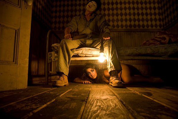
I then looked into Dave's style and tried to develop an understanding of his technique. I thought of one of my own fears and followed a similar style of design. I took a stock photo of a woman lying down and painted over the top in Photoshop. I left the original hair like McKean seemed to do within the book. I added a bed hand drawn with my tablet and then because the project is print related, used the mono-printing technique and drew a creepy figure looming over the bed; almost like the boogie man. Scanning the mono-print into Photoshop I then adjusted it so that it appeared behind the bed but his hands reached over. I then added a wooden floor with a carpet "Soft light" over the top. Using a grundge paper stock I overlayed it on the wall and changed the setting to "Hard light". The picture as a whole has a sort of red devilish glow. Although I left the eyes in I think it carries the technique well.
I then looked into Dave's style and tried to develop an understanding of his technique. I thought of one of my own fears and followed a similar style of design. I took a stock photo of a woman lying down and painted over the top in Photoshop. I left the original hair like McKean seemed to do within the book. I added a bed hand drawn with my tablet and then because the project is print related, used the mono-printing technique and drew a creepy figure looming over the bed; almost like the boogie man. Scanning the mono-print into Photoshop I then adjusted it so that it appeared behind the bed but his hands reached over. I then added a wooden floor with a carpet "Soft light" over the top. Using a grundge paper stock I overlayed it on the wall and changed the setting to "Hard light". The picture as a whole has a sort of red devilish glow. Although I left the eyes in I think it carries the technique well.
Stock photo: http://shiskababe.deviantart.com/art/HIDE-133744128
Labels:
dave,
everything,
illustration,
in,
mckean,
photoshop,
sophie,
the,
university,
walls,
wolves,
work
Wednesday 25 September 2013
Jack Pierson - Identity through print
So after reviewing my lecture notes I took note of an artist Jack Pierson who is new to me. I like the look of his work although admittedly at first I thought it was collaged with paper. After looking into Pierson I found out that his work is in fact sculptural and he uses letters from abandoned buildings or from junkyards to create words and phrases. Although his work is sculptural I would like to create similar pieces using either Photoshop or collaging magazine letters. It will also mean I'm looking into typography as well as creating work relating to my identity.
Tuesday 24 September 2013
First monoprint - Identity through print
I had my first ever University workshop. Woohoo! Our project at the moment is looking into our own personal identity. We are using methods of print to help us discover more about ourselves. The first workshop was Monoprint, something I have previous experience with; I wasn't too delighted at the idea. I thought that after my college days that it would be a drag but I used some letter stamps along with the monoprints and actually enjoyed it a lot more than before. I liked mixing the media of stamps and illustrations together. We were only supplied with black and I felt a little restricted by the colour; although colour shouldn't make a difference I am use to doing much more colourful prints. So seeing as I love food, it was the main inspiration as well as Disney!
The 'mmmmm' was actually created with the letter N because I couldn't find an actual M. I just double up two nns to make a lovely m :)
The 'mmmmm' was actually created with the letter N because I couldn't find an actual M. I just double up two nns to make a lovely m :)
Subscribe to:
Posts (Atom)


