Redesigning my blog I thought it needed a bit of personality, and a sense of the style I like to draw. So I create myself with titles to fit into my blog. The titles all follow the same pattern theme so they tie in together. They are all using the same colours and collage style to fit in with each other.
Tuesday 9 December 2014
Wednesday 3 December 2014
Sequential Illustration
I didn't update any of my work because I just loose track and don't find time to do my blog. I have done two projects but here is the final images for my previous project. I had to design a protagonist and had to place them in a sequence of 5 images. The story is about how Zinnia was born without wings; she has to be independent and clever to make a pair for herself. I did a mixed media shoot similar to my last Narrative project. Zinnia is made from photos of flowers I took myself, along with a drawn body. I then set her in the garden with a butterfly I bought and shot the scenes.
Thursday 18 September 2014
Artists I like #6
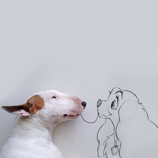
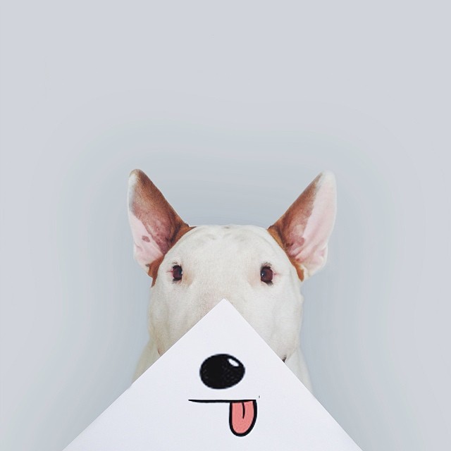
Saw this link posted on Facebook, made me smile. The images are created by an Illustrator Rafael Mantesso. I like the humour to these images as well as the creativity. They all have a range of skill, some being simple and cartoon, others being more realistic and well drawn.
Wednesday 10 September 2014
Advertising I like #3
Watching TV I saw the new M&S Food advert. I loved it straight away. It's an advert I actually enjoy watching. You can always tell when it's an M&S advert because of the quality and effort put into the video. It's strange to compare M&S against Tesco or Morrison, you know the different shops just from a few seconds of advert by how they represent food and the quality of the camera.
I love how they incorporated slow motion and fast forwarding at the same time. I'm not quite sure how they produced the shots to look both slow and fast at the same time but it's pretty impressive. The food always looks so good in M&S adverts whether you like it or not. The music is a good choice too because it matches the quality of food as well as makes the sequence of the video flow quite nicely.The colours are bright and bold and it really makes the whole thing appealing.
Saturday 6 September 2014
Artists I like #5
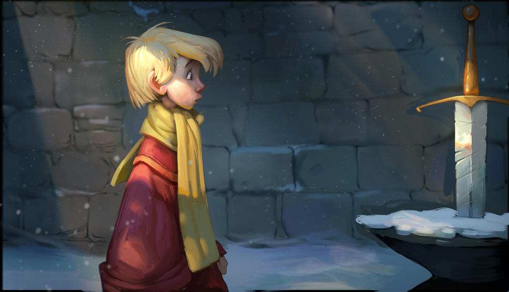
On my trip to Disney World I found an Illustration I instantly loved.
The artist is Jerrod Maruyama. All his work is cute and mostly Disney related. He works as a freelance Illustrator and graduated San Jose State university with a degree in Illustration. I'd love to one day produce work that would be sold by Disney.
Sunday 24 August 2014
Artists I like #4
Saw this image on DeviantArt. Thought it was incredible! She does other facial paintings but this one was my most favourite.
Tuesday 5 August 2014
Artists I like #3
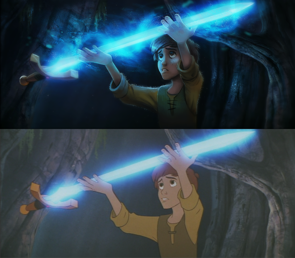
DeviantArt again, I had been shown these images previously didn't take note. Murph3 takes screen caps from Disney movies and paints over the top of them. Although the picture I actually saw was done by Cryptid-Creations. He did an inspired one but remembered I'd seen previous ones by Murph3 before.
Cryptid's version.
Friday 18 July 2014
Artists I like #2
Browsing through DeviantArt again, found a guy who draws peoples portraits in the style they ask for. Really like his drawing styles and how he picks perfect pictures to draw. Some are really fun, especially with pets. Thought I'd take a note as inspiration and as she does omissions I could always ask her questions in the future.
http://banzchan.deviantart.com/gallery/48833371/Pencil-Portraits
Monday 23 June 2014
Artists I like
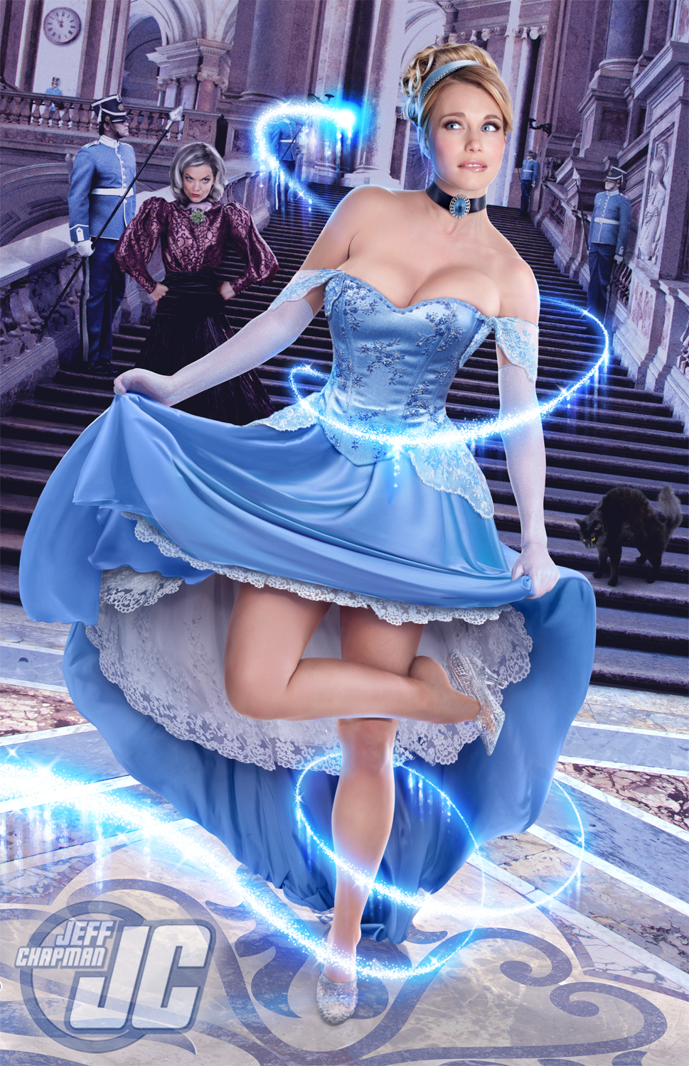
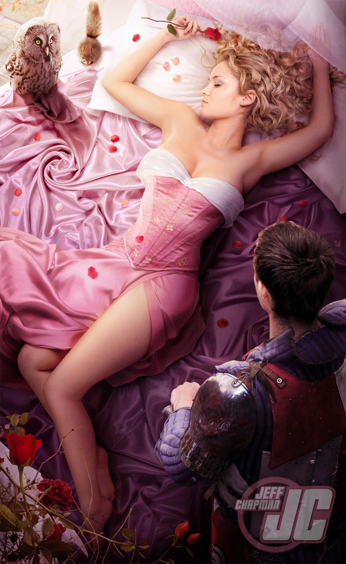
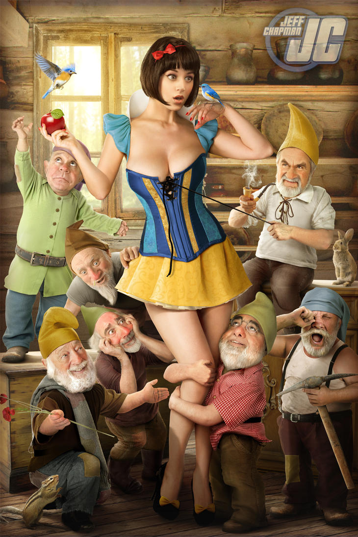
Browsing DeviantArt I came across Jeffach. I remember seeing his work a while ago but recently stumbled upon a new piece he uploaded. Jeffach makes AMAZING photo manipulations, one could only dream of being as talented as this. This is the sort of work I would love to create, I guess it's all about practice!
http://jeffach.deviantart.com/
All of his work isn't one single photograph, they're made up of lots of different photos. Even the body and the head, the legs and face!? A true inspiration for me.
Thursday 12 June 2014
Advetising I like #2
I saw the new Kellogg's advert, made out of paper cutting. I assume it's a stop frame animation but you never know these days.
Apparently Kodaline are "outraged" because they the song used in Kellogg's advert is "ripped off" from their band.
http://www.digitalspy.co.uk/music/news/a577134/kodaline-outraged-at-kelloggs-advert-song-what-a-rip-off.html#~oGXsNfik1rAjSS
Monday 9 June 2014
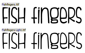
Fonts I like
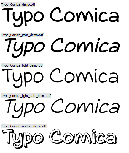
So going on Dafont.com is pretty addictive for me. Once I go on, I can't stop downloading new fonts and eventually when I come to creating something, I forget what I downloaded. So I thought as well as sharing my fav fonts, I could also make a reminder!
Typo Comica
http://www.dafont.com/typo-comica.font
Fish Fingers
http://www.dafont.com/fishfingers.font
Monday 2 June 2014
Commissions
So over the summer holidays so far I've had three commissions. Two of which I was paid for but one I never even received a thanks but that's the way it goes I suppose!
One of the pieces of work was a PowerPoint presentation so not very illustrated!
So both the commisions are graphical work rather than Illustrated but I love doing anything Photoshop related. The first was a company logo which related to Japanese healing, Reiki healing. The symbol I designed is called a Tomoe, with three blades it represents Man, Earth and Sky.
The second design was for a company cover photo, this was the design I
received nothing in reply from. I really enjoyed doing this piece and am
very happy with the outcome!
Labels:
alphabet,
blocks,
building,
commission,
design,
everything,
graphic,
healing,
photoshop,
reiki,
tomoe,
work
Monday 12 May 2014
Narrative Illustration - Flip Book Final
I used a Japanese Account bind when putting together my flip book. Using silver thread I thought it would relate and tie in with the finery of drinking tea during the 17th century. I also added the tassel to match the style of the book. Using silver metallic paint, I painted the edge of the pages like you find silver or gold edges on proper books.
I made the flip book quite humourous, Catherine simply pops up, sees the cup of tea and goes back down with a smile and heart eyes. Stunned by the sight of tea.
Narrative Illustration Final Piece
I really enjoyed creating the final narrative for this project. I took inspiration from Lauren Child's "Princess and the Pea", she uses doll furniture and hand drawn people mixed with fabrics to create little sets to go along with her narratives. I decided to create my own for my narrative of Catherine of Braganza. In the 17th century she ruled as Queen, wife of Charles II. She made tea popular within the English court. My narrative is of Catherine producing the perfect cup of tea.

I bought doll house furniture after researching into the eras furniture and fabrics. I mixed photographs of furniture from the V&A I took, along with the doll furniture arranged with the character illustrations.
Labels:
16th century,
17th century,
catherine of braganza,
charles II,
doll house,
everything,
furniture,
illustration,
inspiration,
lauren child,
narrative,
pinned,
princess and the pea,
set,
university,
work
Tuesday 1 April 2014
Advertsing I like
So I was just scrolling through some magazines looking for some collage material when I saw these two advertisements. They reflect the type of career I want to go into, Creative Advertising. Thought I'd keep them on here just for keepsakes.
Thursday 27 March 2014
My Collections - Professional Practice
So a side project that runs through the year is "Professional Practice", looking into possible careers, artists, exhibitions and all things arty that will develop our professional skills. One assignment was to look at eh V&A collection and then create our own collection. I thought I'd do a doodle of me, in my room, surrounded by my collection. The collection is supposed to be able to identify us as a person. I'm sure mine does.
Labels:
bed. jewellery,
book,
computer,
disney,
everything,
girl,
pc,
practice,
professional,
reading,
toys,
university,
work,
xbox
Saturday 15 March 2014
Tea paintings - Narrative Illustration
I have been doing this project for nearly 4 weeks now but just forgot to add anything. As soon as I did these paintings I was very happy and knew I wanted to pop them up on here!
P.S Thanks Redbush for the free samples, I am afraid I didn't drink them, but painted instead!
Final Piece - Rsearching Methadology
Kind of fell behind on the old blog again, finished the animal research project and I'm now onto the newest Narrative Illustration. I thought I'd just put a few of the pictures from the shoot of my final dresses (which turned into skirts.)
Skirt and scarf 1 - Printed my own design onto fabric
Skirt and scarf 2 - Using felt I made lots of little Robins
Labels:
50's,
bird,
cute,
dress,
everything,
fashion,
final,
methodology,
research,
robin,
skirt,
style,
work
Wednesday 5 February 2014
Robin Lino - Researching Methodology
Having a lino workshop we had to produce some prints with the full body view of our animal. I created the Robin itself at first and decided I wanted the border and background to look almost "woody"; like how wood would look if it had been hacked at. I removed the background in a sort of chiseling method. I didn't do any reduction for this lino although I implemented the process on Photoshop so that I might get an idea on how the piece would look. I have a larger scale piece of lino which I will be creating a print with and hopefully doing some reduction prints.
Labels:
bird,
cute,
everything,
illustration,
lino,
methodology,
print,
reduction,
robin,
sophie,
university,
work
Tuesday 21 January 2014
Rockin' Robin - Methodology
Moving on, but still using my ProMarkers, I looked at the song "Rockin' Robin" mostly known to be sung by the Jackson 5 but was first sung by Bobby Day. I think there's just something about little Michael singing it that really suits the personality of a Robin. I drew the scene of the Buzzard and the Oriole being "Out-bopped" by the Robin; using type to express the motion and sound of Bop. Bopping is a dance move I can't really imagine a Robin actually doing but I'm sure if he did, it would be in the air; mainly because Robins dart so fast I can't see how a bop would be done on his feet.
The pretty little raven at the bird man stand
Taught him how to do the bop and it was grand
He started goin' steady and "bless my soul"
He out-bopped the buzzard and the oriole.
The pretty little raven at the bird man stand
Taught him how to do the bop and it was grand
He started goin' steady and "bless my soul"
He out-bopped the buzzard and the oriole.
How to Bop: http://www.youtube.com/watch?v=6bDjjTabSQU
Labels:
bird,
bop,
everything,
fine liners,
jackson,
jackson 5,
methodology,
michael,
promarkers,
robin,
rockin,
rockin',
rocking,
song,
sophie,
university,
work
Sunday 19 January 2014
Nithin Rao Kumblekar Inspiration piece - Methodology
After looking into Nithin Rao Kumblekar I drew up a sketch of a robin to put onto some stock. I found this beautiful photo provided by Faestock on Deviantart. I added the cloak over the top in red to match the colours of a Robin. I am ultra happy with this picture; the beauty of the model matches the elegance and nobleness of the Robin.

Saturday 18 January 2014
Mixed Media - Methodology
I decided to do some work with water colours and incorporate some photography in with the work. So I thought about using my own stock photos mixed with an illustration of a Robin. It was pretty simple pasting it onto the post but I like how easily the Robin fits into place as if it weren't an illustration at all. I think I might try out different styles of drawing and paste it into similar photographs.

I like the contrast of the black post and green vegetation against the Orange breast of the Robin. I'll probably add some artists who use mixed media in this style to my sketch book.
I found an artist called Nithin Rao Kumblekar which produced a whole series of illustrative images mixed with photographs which I love and would definetely try and do some influential images from.
Friday 10 January 2014
New year, new project - Methodology
I haven't posted in a while so I have set myself a goal to write at least one post a week! I totally lost track of the book project I did so I thought I'd just chuck in the final design as well as my new project starting point.
So these were my final cover ideas for the book "Lolita". I enjoyed researching this book so much, it really was an enjoyable project.
So my new project involves picking an animal and basing our whole project on it, with lots of research. (Which I happen to love doing research. ) My chosen animal is a Robin!
Subscribe to:
Posts (Atom)


