Wednesday 5 October 2016

Inktober

I started Inktober this month, the challenge is to draw every day during the month of October. It seems really fitting seeing as I just started my Illustrative Instagram account and need to put work out there! I've added my Instagram to both my website and blog which can be found along the menu; otherwise my account is @sophiekingillustrations. Feel free to give me a follow if you'd like, I'll be posting daily during October! 

 My drawings with range from style and time taken, some will be quick doodles while others will be longer projects. I hope I can do them daily, I don't see why not..

Here's a couple I've done so far.
 
https://gyazo.com/fe98d73ad2afe5bca8317102fb8cd561 https://gyazo.com/009e95c3cd39f88b1b14cede068b603b

Tuesday 30 August 2016

Once Upon A Time In Lari

Upon my recent travels to Tuscany, Italy, I visited a small town called Lari. Lari is known for its circle center that circles round a medieval castle. You can make your way to the top and venture inside to look around. It's in quite impressive condition and being a fan of the medieval period I enjoyed the visit. Inside the tourist shop were these two books that I straight away wanted to buy because of the colours and illustrations. The artist is Tommaso Levente Tani.


 They are fun interactive picture books that appeal to multiple ages. The reason I wanted these so much is because it's an aim of mine to produce a picture book similar to these that have historical information. The set of two consists of one history book explaining the history of Lari and how the castle and town grew over the years. The other book is a fold out activity booklet which has small puzzles and games to do.

 I also got drawn to these books because of the focus on Heraldry they both have, even down to designing and meanings. I previously did a project on Heraldry and find the topic extremely interesting.

 The pages are beautiful and colourful, the translation from Italy is a little bit poor and some of the sentences don't quite make sense but it's still a lovely book to add to my collection. The illustrations are vector based with quite a simplistic style, the characters have a "copy and paste" feel but it works really well. I think these are lovely little books with lots of information displayed in a very attractive way!

Friday 22 July 2016

Summer Card Project

I got notified of this event on DeviantArt called the Summer Card Project. It involves creating a card or two with the theme of summer but also a get well/ thinking of you card. The purpose of the cards are to be sent off to hospitals and given to those who are ill or injured from young to old. Summer is my favourite season and I enjoy creating cards so I thought it would be a nice idea to join in.

I wanted to create a card that wasn't purely summer themed (i.e not a bucket or beach) so I decided to pick a sunflower for the element of one card and a bumble bee for the other.


The Bee card is just coloured card stacked up with a hole through two players to reveal the white. I did this with a circle cutter. I then hand drew the bee and coloured with Pro Markers. I used foam stickers to make the bee "float" and did a speech bubble pun related to the bee. The idea is not to say "Get Well Soon" but provide a message that's uplifting. I drew the dotted line and the final card I was pretty pleased with!


The next card I designed involved using watercolours and just doing blog shapes which would then be drawn over with a black fine liner. The "blobs" of paint just suggest the shape of the object with the fine liner defining the shape. The idea isn't supposed to be perfect in-the-line picture but more childish and still looks good. I also have plans to reproduce this card theme and sell them on my Etsy shop!

I'm very happy with both cards and I included my website for whomever receives my card, hopefully they let me know as I'd be excited to find out who receives it! If you want to find out more about the SCP the link is below. It closes on the 31st July so it may be too late for countries outside the US but it happens at Christmas time too so you could participate then as well!

Tuesday 28 June 2016

Final Year Show

The final year show has come and gone! I submitted 3 A2 screen prints along with a landscape book of Renaissance Architecture. After a year of trial and error I finally nailed the technique for large screen prints and I'm really happy with how the finals came out. 


For the show I also created some free to take zine books with a little bit of information about the buildings themselves. I had work on sale in the shop including one of the buildings as well as some prints of the HMS Victory I did previously.


The landscape concertina book, made up of the same prints as the larger scale versions. Handmade the covers and bound myself. I learned so much about Renaissance architecture over the year and it really inspired me. I enjoy historical subjects so much and probably enjoying researching more than producing actual artwork! 


I presented my prints as a sort of "planning wall", perhaps how an architectures study may look. Pinned up prints and plans to build a bigger picture. Although I didn't manage to sell any prints at the show I shall be selling them on my Etsy page. I also have been contacted since with an offer to sell my work on a website but I'm not particularly interested as they were only willing to offer me 20% of the selling price. Now I just have to produce more personal work and get out into the world with my 2:1 degree!

Friday 17 June 2016

Smite Tweet

So I've been doing more doodles and drawings of Gods from the video game Smite and yesterday I saw that they'd actually tweeted it on their Twitter! They don't really tweet fan art so it was quite surprising to see my work. Especially as it isn't even the greatest fan art around of Smite! Still it's quite an achievement for me and they even linked in my DeviantArt which is really nice of them!


Friday 20 May 2016

Watercolour painting #2

I did another painting with water colour after really enjoying my last one. I did another character from the video game I play and tried my best to really work on the skin colours and shading. Nox is the the Goddess of the Night in Greek mythology. Although I believe in actual mythology it's spelt Nyx. She's believed to have such exceptional power and beauty that she was even feared by Zeus himself. She's a mother to many other Greek
deities such as Hypnos (Sleep) and Thanatos (Death), with Erebus (Darkness).


I posted the image onto the Reddit site for Smite and it was very well received. The community are actually very encouraging and really enjoy fan art. 

I also posted the image on DeviantArt and it's probably my most favourited image so far. I used water colours, acrylic white fine liner, white Indian ink and a gold metallic paint. I will produce many more of the characters as I find their costume and character designs to be really beautiful.

Monday 2 May 2016

Watercolour painting

Haven't done any water colouring in just over two years, got even some new range of colours and decided to try them out. Previously I had 8 colours whereas now I have a palette of 24! No white though for some reason, so that's done in acrylic watered down as well as an acrylic white pen.  It's quite different style from how I usually draw but I feel like I'm testing my boundaries a bit and building my portfolio of work!


The painting is of a character named Nu Wa from the video game Smite. Nu Wa is the god of humankind in Chinese mythology and I have quite an interest for historical myths and legends so I think it still fits into my work! It was just nice to paint something different and take a break from so much digital work.

Monday 18 April 2016

Logo comission

I got asked to do a logo design for a new merging band, Cherry Bomb. I did some rough sketch ideas and then adapted from there.


It was my first time using Illustrator and my graphics tablet because I wanted the logo to be vector based. I will definitely try Illustrator out again because the vector paintbrush is like a blessing! I also need to increase my Illustrator skills so that I can work in a more broad job! I'm pretty happy with how it came out and can't wait to play around some more with the paint brush.


Monday 11 April 2016

Florence Cathedral prints

I did a few experimental prints for my Florence Catherdral building a few weeks ago, just got around to photographing them as they were large scale and hard to get home on a bike! I was playing around with paper textures, sizes and printing different amount of layers and colours. They are A2 with the last image being A1. I still don't really enjoy doing silk screening at large scale as the process is quite stressful but it does produce some really nice prints!

I tried using this triangular paper, it was kind of pre-scored paper and I thought it suited architecture well in relation to trigonometry. Although you can see the triangles through the print.  I also tried a yellow background on white paper.
 Lightening up the grey, making it less purple gave the building quite a nice feel.


 I used some antique white card, so it is slightly more cream than white. I also made this print four layers adding a white outline underneath the black to sort of add an element of highlights. I really like how this print came out.
 These last two prints were more experimental adding in mixed media scraps of paper that didn't work quite well. The last image didn't come out at all and I can only put that down to the paper type, it was thick and heavy water colour paper and no matter how many times I'd go over the screen it wouldn't come through!

The development progress has come on well since these prints and I'm currently producing the last large scale! Will get photographs of those as I produce them. 
 

Monday 14 March 2016

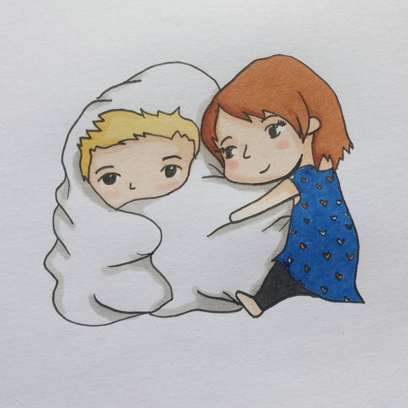
My "process"

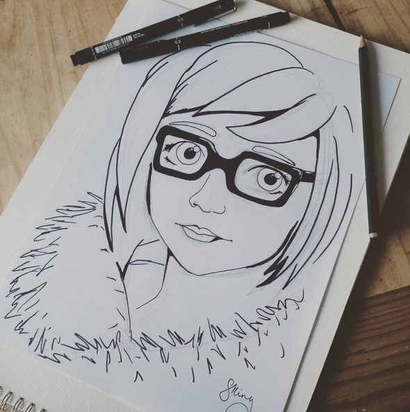
Thought as I was creating some illustrations I'd document the journey and show my favourite way of creating art work. I started out with drawing in pencil and then outlining in fine liners, 0.3 and 0.1. These sketches were some ideas for my business card. I couldn't decide whether I wanted it a portrait of me or show off my historical passion.

 Next I scanned the outline into Photoshop and clean up the image removing any specs that manage to show up in the final image. 


 Adding the clothing is probably my favourite part of the process, I find images or fabrics online or those I've scanned in myself and add them into the drawing. For the tudor dress I found a dress online that I liked the pattern of, using layer masks I select the area I want the dress to display in.


 Using Liqufiy I then manipulate the dress to fit into the drawn outline to make it fit my character. Sometimes (like I had to do for this image) I create multiples of the same layer but tweak them to fit each element separately. For example the top half of the dress is in three layers, the bust and two arms. This way I can make the outfit fit much better.


One all of the outfit is fitted into place I just use Dodge and Burn to add highlights and shadows to the dress where it matches on my outline or perhaps where shadows should be that aren't on the fabric. On this specific dress I added highlights and shadows to the pleats, shadows to the inner sleeve, under the arms and highlights to the chest.


 The same principle applies to the other character!


Then I print the images onto 90gms paper on High setting. Sometimes I print on thicker paper depending on what I need the characters for. I colour the hair and skin with pencils and anything black I also colour with pencil. Printing black fabric just consumes more ink and comes out quite dark, whereas with pencil I can create shadows and textures without the ink usage. 


Using a scalpel I cut them out!


I use a black felt tip  to go around all the edges of the characters, this is a tip I learned from Terry Gilliam. The black takes away the sharp white paper edge and makes the characters seem more realistic and less paper like. 


These characters then were posed in sets, I have a small set pre-made for tudor settings with doll furniture and having my dad be a gardener means there's always colour and flowers in our garden anytime of the year which gives me free sets (if the weather is good!)


 The photos I take then go through the adjustment process in Lightroom. Small adjustments to make the colours correct or more vibrant. Moving back into Photoshop with the final images I played around until I got some card designs I quite liked. The tudor design went through a bigger process of highlighting and shadowing and adding in the fireplace. The photos could also be used for images, stories or anything else I like. I take a huge range of photos at different angles to make a bigger range to choose from.
Wednesday 9 March 2016

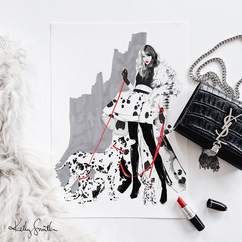
Artists I Like #11

I have been trying to find some large scale prints similar to my buildings, so A2, and seeing how artists present them. I was trying to find some simple image searches on Google by searching "A2 fine art prints" when I saw some limited edition fashion prints. They caught my eye immediately because of the content being Disney, anyone who knows me knows I love Disney. Not only were these Disney prints but they were beautifully hand drawn fashion sketches. I've always loved fashion sketches, although I'm not particularly interested in fashion, the sketches themselves are always beautiful and creative drawings.

On top of them being drawn, coloured and styled so well they are also photographed in a setting that matched. The artist is Kelly Smith and she does even more wonderful fashion sketches beside just these prints! Sometimes you find inspiration even when you aren't looking for it.


Friday 4 March 2016

Southsea Rock and Gift Brief

I was set two briefs, one to create a greetings card and the other to create a gift that would be given to international students when our University travels. Both of these had to represent Portsmouth and they could both be of the same design. So I created a greetings card featuring the HMS Victory made in the same way I create my Renaissance buildings, in type. I then screen printed 4 layers to build up the colours and outline of the ship. I enlarged the ship to A3 and printed the same four layers and colours which I then made into an informational fact book about Victory that worked as a 4 fold booklet that could be unfolded into a poster .