Showing posts with label design. Show all posts

Tuesday, 30 August 2016

Once Upon A Time In Lari

Upon my recent travels to Tuscany, Italy, I visited a small town called Lari. Lari is known for its circle center that circles round a medieval castle. You can make your way to the top and venture inside to look around. It's in quite impressive condition and being a fan of the medieval period I enjoyed the visit. Inside the tourist shop were these two books that I straight away wanted to buy because of the colours and illustrations. The artist is Tommaso Levente Tani.


 They are fun interactive picture books that appeal to multiple ages. The reason I wanted these so much is because it's an aim of mine to produce a picture book similar to these that have historical information. The set of two consists of one history book explaining the history of Lari and how the castle and town grew over the years. The other book is a fold out activity booklet which has small puzzles and games to do.

 I also got drawn to these books because of the focus on Heraldry they both have, even down to designing and meanings. I previously did a project on Heraldry and find the topic extremely interesting.

 The pages are beautiful and colourful, the translation from Italy is a little bit poor and some of the sentences don't quite make sense but it's still a lovely book to add to my collection. The illustrations are vector based with quite a simplistic style, the characters have a "copy and paste" feel but it works really well. I think these are lovely little books with lots of information displayed in a very attractive way!

Monday, 14 March 2016

My "process"

Thought as I was creating some illustrations I'd document the journey and show my favourite way of creating art work. I started out with drawing in pencil and then outlining in fine liners, 0.3 and 0.1. These sketches were some ideas for my business card. I couldn't decide whether I wanted it a portrait of me or show off my historical passion.

 Next I scanned the outline into Photoshop and clean up the image removing any specs that manage to show up in the final image. 


 Adding the clothing is probably my favourite part of the process, I find images or fabrics online or those I've scanned in myself and add them into the drawing. For the tudor dress I found a dress online that I liked the pattern of, using layer masks I select the area I want the dress to display in.


 Using Liqufiy I then manipulate the dress to fit into the drawn outline to make it fit my character. Sometimes (like I had to do for this image) I create multiples of the same layer but tweak them to fit each element separately. For example the top half of the dress is in three layers, the bust and two arms. This way I can make the outfit fit much better.


One all of the outfit is fitted into place I just use Dodge and Burn to add highlights and shadows to the dress where it matches on my outline or perhaps where shadows should be that aren't on the fabric. On this specific dress I added highlights and shadows to the pleats, shadows to the inner sleeve, under the arms and highlights to the chest.


 The same principle applies to the other character!


Then I print the images onto 90gms paper on High setting. Sometimes I print on thicker paper depending on what I need the characters for. I colour the hair and skin with pencils and anything black I also colour with pencil. Printing black fabric just consumes more ink and comes out quite dark, whereas with pencil I can create shadows and textures without the ink usage. 


Using a scalpel I cut them out!


I use a black felt tip  to go around all the edges of the characters, this is a tip I learned from Terry Gilliam. The black takes away the sharp white paper edge and makes the characters seem more realistic and less paper like. 


These characters then were posed in sets, I have a small set pre-made for tudor settings with doll furniture and having my dad be a gardener means there's always colour and flowers in our garden anytime of the year which gives me free sets (if the weather is good!)


 The photos I take then go through the adjustment process in Lightroom. Small adjustments to make the colours correct or more vibrant. Moving back into Photoshop with the final images I played around until I got some card designs I quite liked. The tudor design went through a bigger process of highlighting and shadowing and adding in the fireplace. The photos could also be used for images, stories or anything else I like. I take a huge range of photos at different angles to make a bigger range to choose from.


Tuesday, 17 November 2015

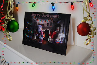
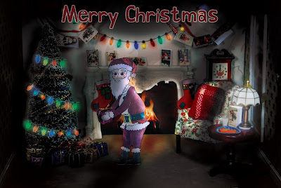
Updated Christmas card #3

I finally got my main design finished for my Christmas card and it's now available for purchase! I re-done the lighting on the card and made some small tweaks, like turning the lamp on. I'm very happy with the outcome and I know have it for sale on Etsy!


https://www.etsy.com/uk/listing/256498056/santa-visiting-christmas-card?ref=listings_manager_grid

https://www.etsy.com/uk/listing/256498056/santa-visiting-christmas-card?ref=listings_manager_grid
 

Saturday, 14 November 2015

Christmas cards #2

I finished another design set for Christmas cards, these are a unique idea I haven't really seen before. They're recipe cards so the actual Christmas card has a bit more use to it rather than just being recycled after Christmas!
I'm selling them on my Etsy shop 🎅 


Tuesday, 9 December 2014

Blog characters

Redesigning my blog I thought it needed a bit of personality, and a sense of the style I like to draw. So I create myself with titles to fit into my blog. The titles all follow the same pattern theme so they tie in together. They are all using the same colours and collage style to fit in with each other.


Monday, 2 June 2014

Commissions

So over the summer holidays so far I've had three commissions. Two of which I was paid for but one I never even received a thanks but that's the way it goes I suppose! 
One of the pieces of work was a PowerPoint presentation so not very illustrated! 
So both the commisions are graphical work rather than Illustrated but I love doing anything Photoshop related. The first was a company logo which related to Japanese healing, Reiki healing. The symbol I designed is called a Tomoe, with three blades it represents Man, Earth and Sky.
  The second design was for a company cover photo, this was the design I received nothing in reply from. I really enjoyed doing this piece and am very happy with the outcome!