Showing posts with label silk screen. Show all posts

Friday, 4 March 2016

Southsea Rock and Gift Brief

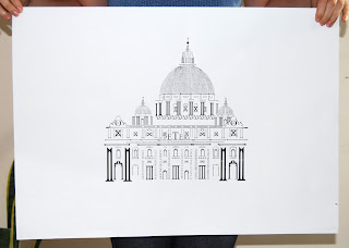
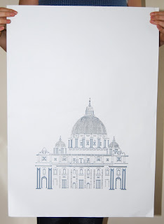
I was set two briefs, one to create a greetings card and the other to create a gift that would be given to international students when our University travels. Both of these had to represent Portsmouth and they could both be of the same design. So I created a greetings card featuring the HMS Victory made in the same way I create my Renaissance buildings, in type. I then screen printed 4 layers to build up the colours and outline of the ship. I enlarged the ship to A3 and printed the same four layers and colours which I then made into an informational fact book about Victory that worked as a 4 fold booklet that could be unfolded into a poster . 


Friday, 13 November 2015

St Peter's Architecture

My self directed project for my final third year is The Renaissance. It started off with Rome as a general focus and slowly I decided I love the architecture and artists of the Renaissance period.  I create this image based on work by Cameron Moll who creates images of structures in type. I chose St Peter's because of how impressive the architecture is not just inside but outside too. I used Times New Roman because that's the type face that can be seen on the outside of the building, I only used numerals and letters to create the shape of the building. 
I then took the image and created it into a silk screen, I tried two toned layers as well as including colour to certain parts of the building. I worked at an A3 scale on Photoshop and printed onto A2. You can see the whole collection of prints on my website or by clicking one of the images. 

http://sophiemayking.wix.com/sophieillustration#!renaissance/cyf1

http://sophiemayking.wix.com/sophieillustration#!renaissance/cyf1


Tuesday, 20 January 2015

Screenprint Posters - Social Awareness

I started to try out some visual work for my video game project by exploring how to visual the facts I'd found out. I created the posters in InDesign and tried to play with the words on how I presented the facts. So I tried to make the "Sharpen" seem out of focus on the poster about eyesight and for the gender I did a male and female video game counterpart. The font along the bottom was not a successful choice for silk screening as it would dry out too quickly and result in it not printing. I also think the screen was either too exposed or there was something on the paper because it would print grains. The grains did go after the screen dried out with some ink on but then so did the font along the bottom. I'll have to change the font if I want to print these again. 

  
This one I haven't made into a screen yet because it needs to blur with half tone dots, using an effect blur won't come out on the silkscreens.